
Dalí: Magazine Covers & Ads
Curated by Kelsey Hallbeck
Like other artists of the 20th century, Salvador Dalí worked as an illustrator for newspapers and magazines, though in comparison to the other artists, Dalí was the most devoted to working commercially and invested the most energy into it. This possibly was due to a concoction of his own self-promoting tendencies, desire to explore the medium and an already established love of the press. In his own words: “And if it is true that I love publicity, for a thousand and one reasons, all respectable, it is an undeniable fact that publicity loves me with a passion more violent than my own” (Salvador Dalí and the Magazines, 12).
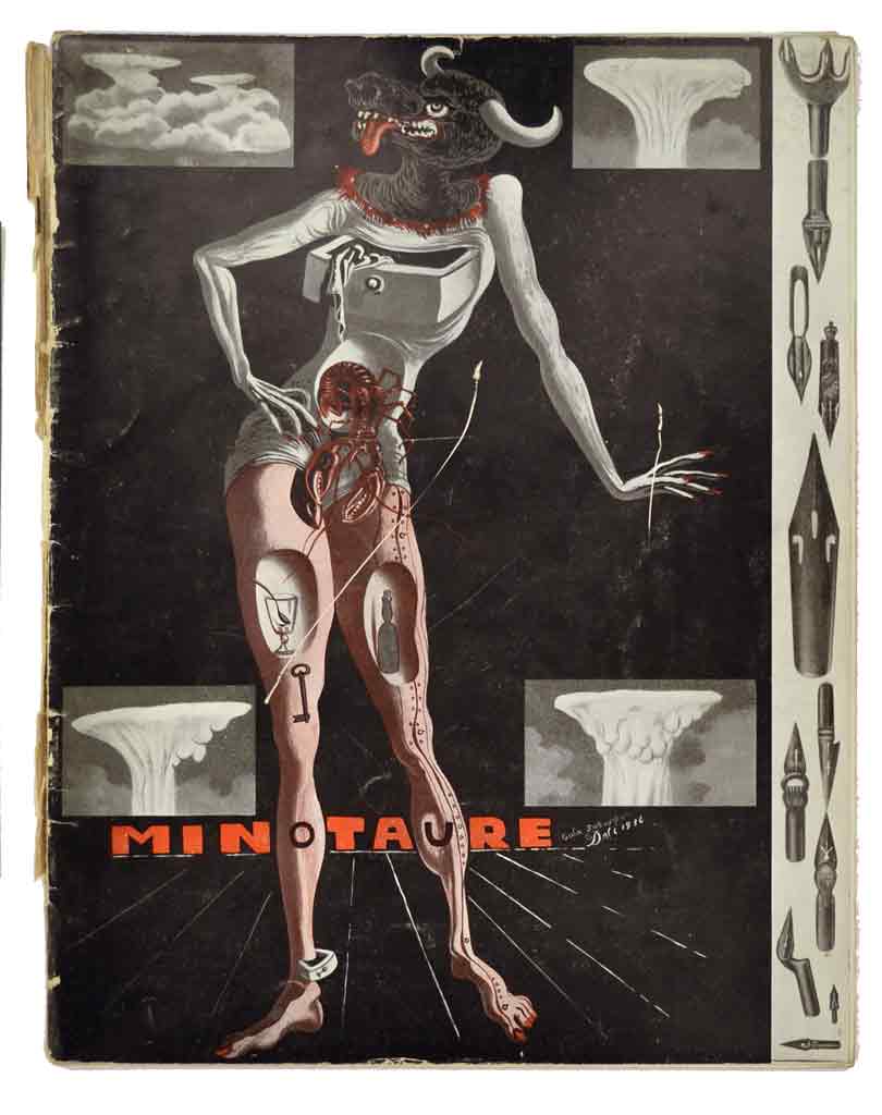
Coincidentally, his induction into the surrealist group, the advancement of his status as a surrealist, and his work for magazines all occurred in the same decade, starting in the late 1920s and continuing on through the 1930s, which is considered by scholars to be the most formative and successful era in his career (Salvador Dalí and the Magazines, 17). He not only painted, but also simultaneously collaborated with the following artistic journals: L’Amic de les Arts, Le Surréalisme au service de la révolution , La Gaseta de les Arts and This Quarter (Salvador Dalí and the Magazines, 11 & 17). He created illustrations to accompany his writings, but was predominantly viewed as a writer, not an illustrator while working for these publications. The cover he illustrated for the June 15, 1936 issue of Minotaure is one of the first examples of Dalí’s illustrative work taking center stage.
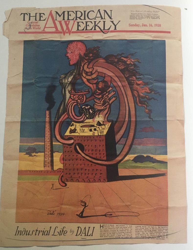
January 16, 1938
Collection Fundació Gala-Salvador Dalí
It was not until the second half of the 30s that Dalí’s work illustrating for magazines grew rapidly. He began to travel to the U.S. for the first time in 1934 for exhibitions (Salvador Dalí and the Magazines, 32) and was introduced to the American press. The main catalyst launching him into American media was William Randolph Hearst, with whom he signed a contract by the end of that year to illustrate pages for one of his publications, The American Weekly (Dalí & Mass Culture, 194).
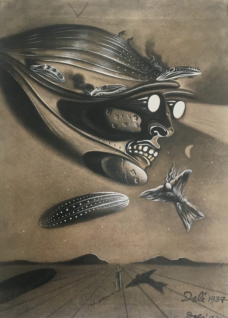
November 1937
Private Collection, New York
In terms of publicity, Dalí could not have asked for better exposure. The American Weekly had an estimated print run of 60 million. As per the contract, he began illustrating pages in 1935, and between 1937 and 1938 and later he advanced to illustrating a few covers for The American Weekly (Salvador Dalí and the Magazines, 32).
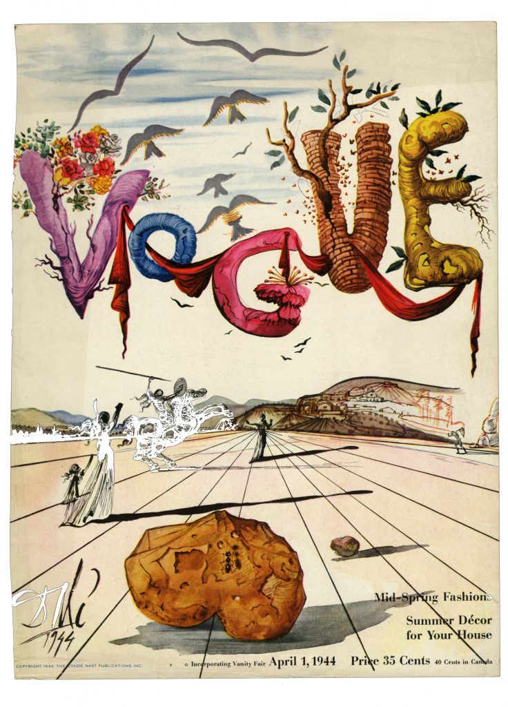
April 1, 1944
If the 30s was when he created what is considered to be his best work (many people believing him to be the pinnacle of Surrealism), it was in the 40s and 50s when he reaped the fruit of his labor, in terms of popularization and recognition. With his 1940 move to the United States, where he worked uninterrupted until 1948, his illustrative work for magazines increased exponentially.
He was in particularly high demand in fashion (Salvador Dalí and the Magazines, 12), working to create ads and covers for The New Yorker, Harper’s Bazaar, Vogue and Town & Country (Salvador Dalí and the Magazines, 39).
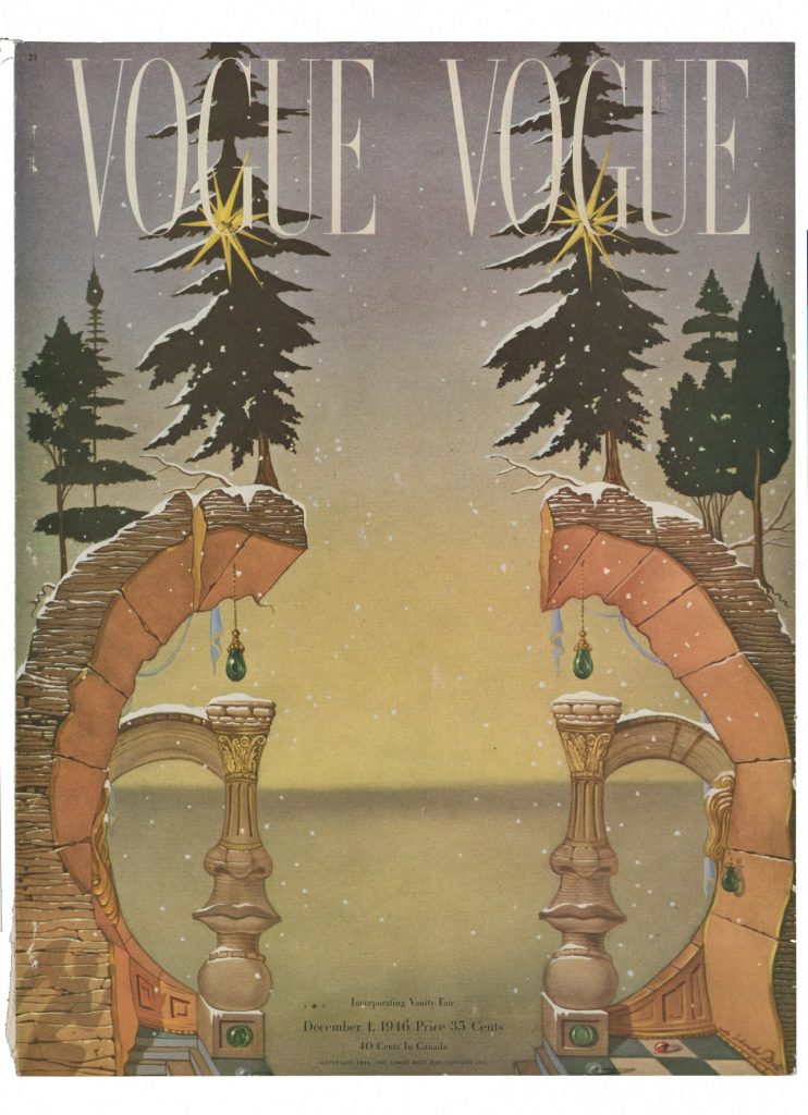
December 1, 1946
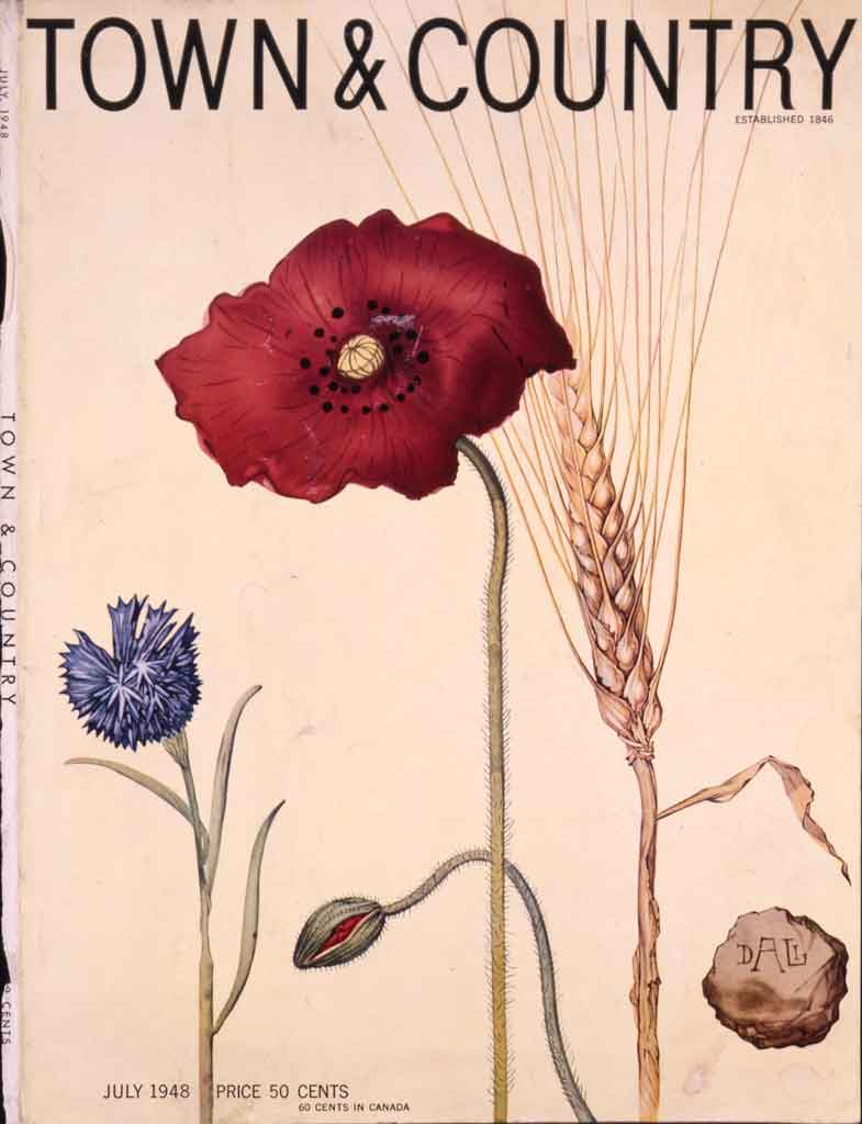
July 1948
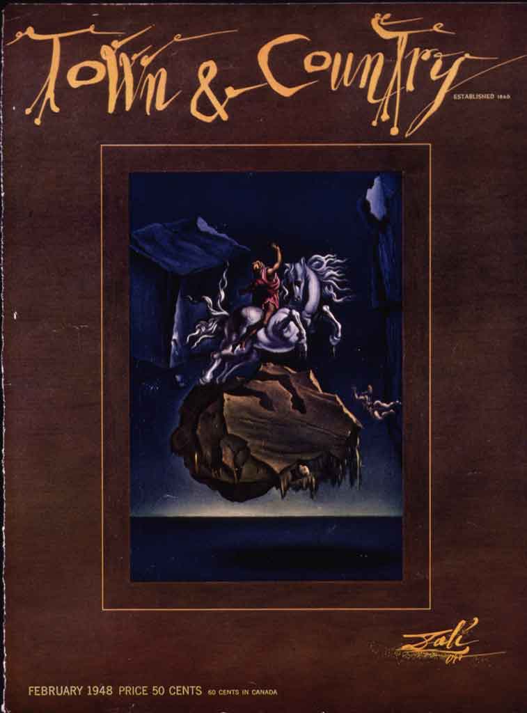
February 1948
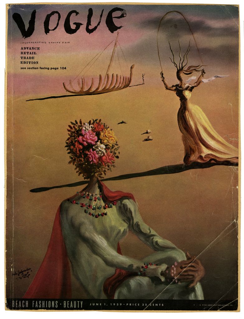
June 1, 1939
It is important to note that while he was both designing for mass production and making individual works, the iconography he used did not change and was a repetition of his Dalínian themes. On the Vogue 1939 cover, for example, is displayed one of Dalí’s “metamorphic women with flower-heads” which were present in many of his works since the mid-30s (Salvador Dalí and the Magazines, 39). This Dalínian icon was physically created twice in 1936 for the window display for Bonwit Teller and for the “Fantastic Art, Dada, Surrealism” exhibition at Museum of Modern Art in New York. In both instances, a female mannequin was displayed with a flower-head. Roses in his work predominantly refer to feminine beauty, transformation and female sexuality (Dalí Museum). He even used roses appended to female figures as an early representation of Gala before the use of the Madonna and Angel icons (The Shameful Life of Salvador Dalí, 262 & 287). An example present in our own permanent collection is the painting Three Young Surrealist Women Holding in Their Arms the Skins of an Orchestra.
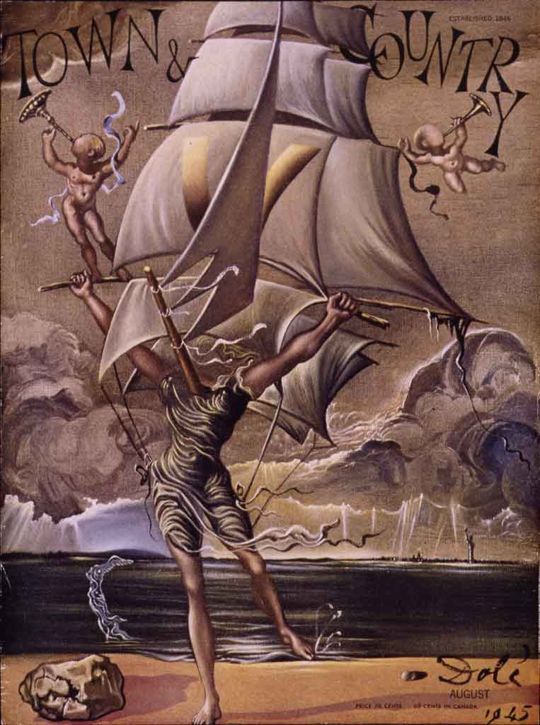
August 1945
On the August 1945 cover of Town & Country Dalí did not merely repeat some of his own iconography. Instead, he chose to mimic one of his 1942 works, The Ship, a gouache on chromolithograph. This work is included in our permanent collection and demonstrates Dalí’s capacity to scrutinize and reconfigure the visual world, then present this new vision for others to see. As with The Ship, in this Town & Country cover Dalí rigs the massive sails onto the back and body of a hermaphroditic creature, suggesting some mythological figure.
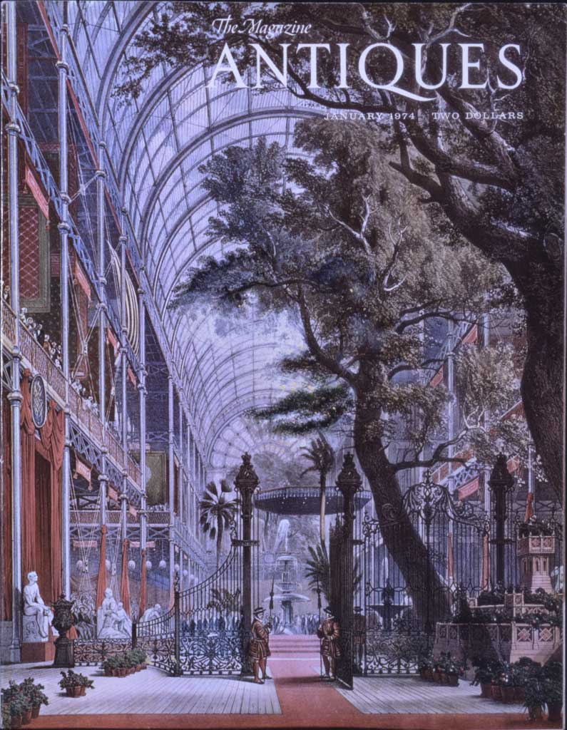
Dalí’s interest in designing covers for magazines took an interesting turn starting in the early 40s. Applying his paranoiac-critical method, which he used to exploit connections created by the subconscious using irrational knowledge, he would alter an already existing magazine cover using materials such as “tempera, colored pencils, and biro” (Dalí & Mass Culture, 195). An example of this would be the Antiques magazine cover of 1974, where he created a human face from the imagery provided.
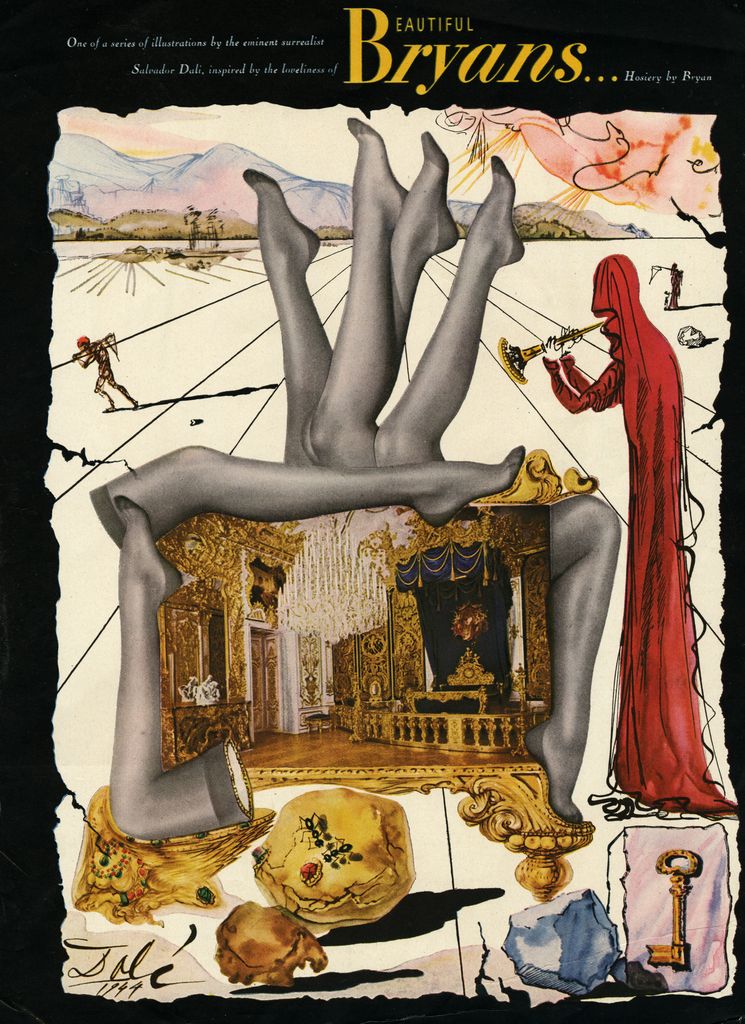
His illustrative work for magazines was not limited solely to covers. Between 1944 and 1947, Dalí was commissioned to create a series of exclusive illustrations for Bryans Hosiery, intended to be ads that would appear in the same magazines for which he was illustrating covers: for example, Harper’s Bazaar, Town & Country and Vogue (Salvador Dalí and the Magazines, 12). Bryans chose Dalí hoping to impress consumers with Dalí’s name and hoping that he would create a shocking campaign (Salvador Dalí and the Magazines, 12). However, unbeknownst to Bryans, Dalí could not have asked for a better theme with which to work, nor could he have been given a theme that captured and showcased surrealist fetishism so well. The leg was one of the main body parts fetishized by the surrealists, others being the feet, hair and eyes (Post-Impressionism to World War II, 387). The use of these fetishes was not limited to Dalí. Hans Bellmer’s doll sculptures and Eli Lotar’s dismembered cow hooves from the La Villette abattoirs photograph series are other examples. For the advertisements Dalí deviates from a traditional display of hosiery, and instead opts for a more unconventional arrangement: pointing truncated legs up and down, right and left, stacking them, multiplying them and even arranging them to make arches. When only the hosiery was displayed in the ad, he seamlessly worked his design around it, creating a cohesive composition.
See also: Harper’s Bazaar, April 1948
See also: Vogue, September 1, 1945
See also: Vogue, March 15, 1947
See also: New Yorker, June 7, 1947
See also: Vogue, May 15, 1944
See also: Vogue, March 1, 1945
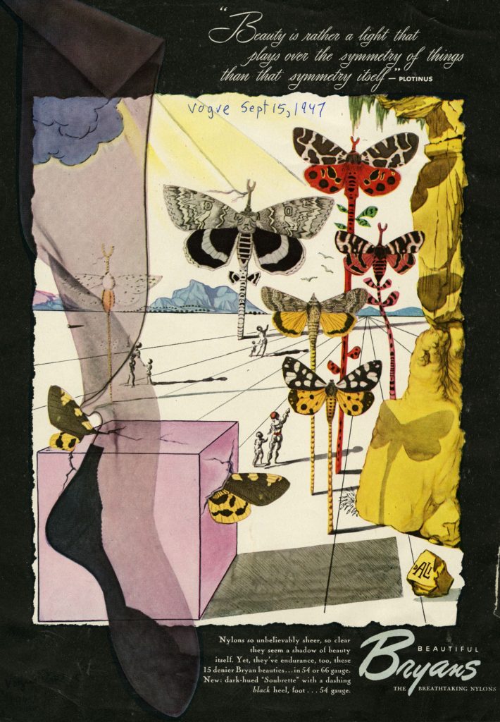
Theme aside, he was able to both sell the product and work his own iconography into the design. The two outstanding symbols that he used in the ads were butterflies and landscape. Butterflies were Dalí’s favorite symbol from the 50s onward. “In Old Greek the word ‘psyche’ meant soul and butterfly. We only need to think about the transformation of the pupa into a butterfly to understand why Dalí was fascinated by the enormous amount of variety, colors and lightness of the butterfly” (Dalí Museum). Landscapes and rocks were often used in his paintings and illustrated books as well. They were predominantly located in the background. This iconography was representative of his native Cadaqués and the many corporeal rock formations found there that repeatedly served as inspiration for him. Other prominent symbols that make a repeated appearance are:
Ants: symbolizing death, decay and desire (Dalí Museum)
Keys: The key symbolizes unlocking the unconscious and exploring the mind. The key is a symbol adapted from Sigmund Freud, and also has sexual connotations (Dalí Museum)
Soft watches: The main theme of the limp watches is the contrast between the hard outside and the soft inside. We expect and our experience tells us that a watch is hard. A real clock gives us the exact time; the watches of Dalí are timeless. By making the clock soft it becomes impossible for it to function and so it refers to eternity. Dalí said that when he was with Gala or when was painting, time had no influence on him (Dalí Museum).
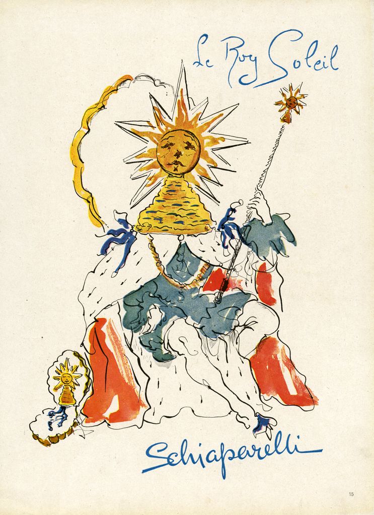
Dalí also illustrated ads for Elsa Schiaparelli. Both artists excelled at garnering media attention, and their work as well as personas were celebrated (Dalí & Schiaparelli, 110) which made for a good working relationship. Dalí created magazine ads for Schiaparelli’s lipsticks and perfumes, contributing largely to both the campaign and design of the bottle for her Le Roy Soleil fragrance.
A new generation of artists emerged in the 50s but gained increasing momentum in the 60s. They used various forms of media such as comics, film and the illustrated press to build the foundation of their future work and to use as inspiration. Dalí welcomed the emergence of these artists, with a few of them even expressing their admiration for him. Those being James Rosenquist, Roy Lichtenstein, and Andy Warhol (Dalí & Mass Culture, 214). Despite the newcomers, Dalí remained invested in commercial design, working nearly until the end of his life in 1989. He continued to design advertisements, creating ads for an Osborne brandy bottle (1964), Perrier Mineral Water (1969) and Lanvin Chocolate (1970) and many more (Dalí & Mass Culture, 32, ,34, 35). In 1971 he designed the Christmas issue of Vogue, which he dedicated to Gala, and in 1981 he designed his last magazine cover, which was for Harper’s Bazaar Italia (Dalí & Mass Culture, 35, 37). His last collaborations with the press, ironically enough, brought him back to his roots as a writer with his last writings dated 1985 for El Pais and ABC.